1.
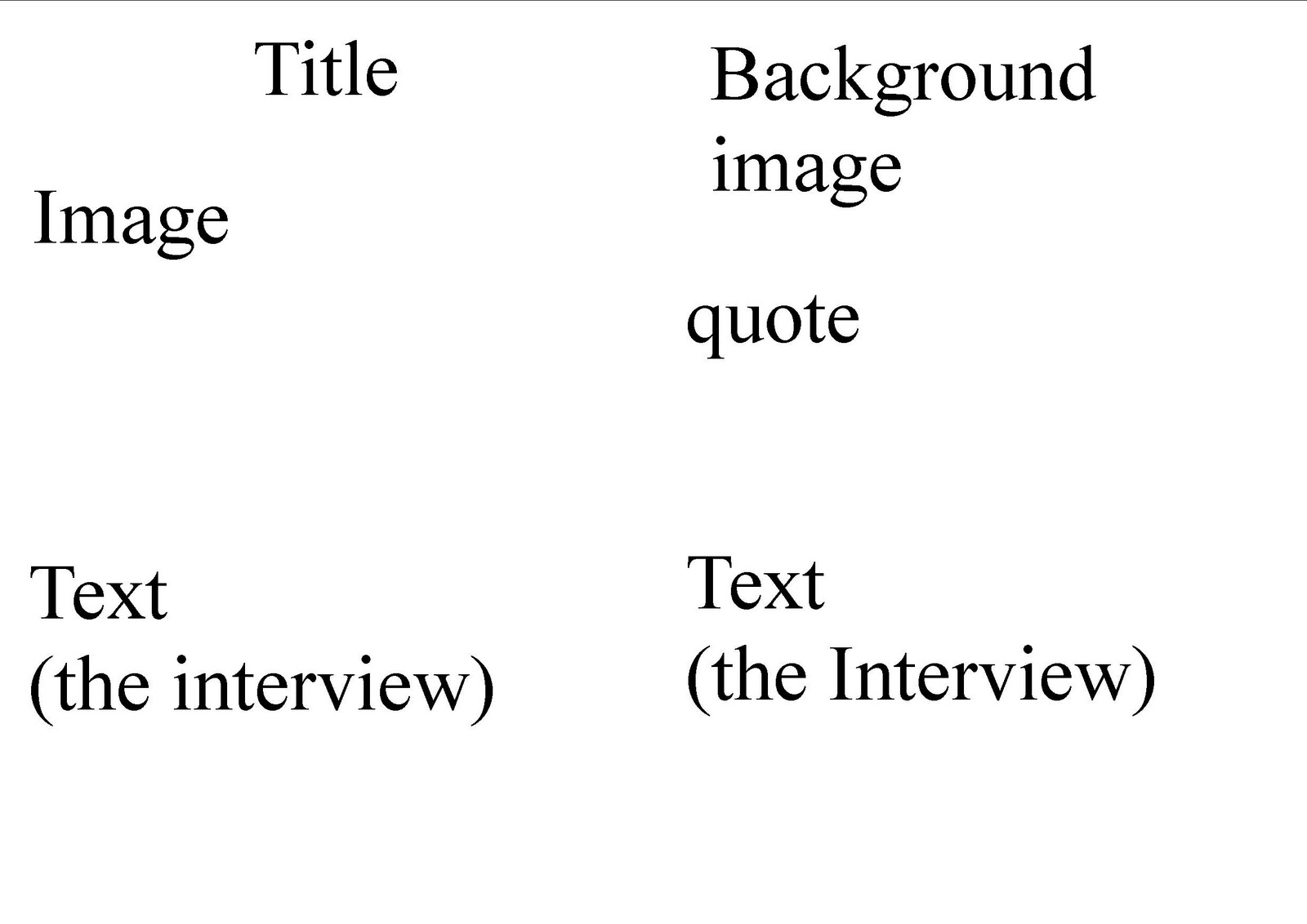
These are my two double paged spread designs. Both of them are mainly picture based but also have an interview from the featured band on them. I think images work effectivly.
2.


 My front covers I have designed. I want to use one main big image and possibly some small ones. Also some big titles and articles to make them look eyecatching. Also some nice warm colours but not to many so it doesn't look too busy.

 This contents page is divided into 4 sections. Features, The Songwriters, Every month and review. Each section is displayed differently to make them stand out. Features and Every month have a red background with white writing, and Songwriter has a blue background with white writing. Q Review is written in bold big writing, almost to make it stand out more, suggesting its more important than the other sections. Its a very simple page, nothing is to complex.
  This is Rolling Stone magazine. Its usually based in the U.S.A and it focus's on music, politics and culture. There's an issue every fortnight. It is published by Jann Wenner. Rolling Stone isn't aimed at any specific audience, for they feature many different artists. The origin of the name isn't known, but its suggest it comes from alot of songs e.g Bob Dylans "Like a rolling stone".
 The name of the magazine "The Big Cheese" is displayed on the top left hand corner, with the issue number beneath it.This gives a sense of brand identity. Underneath you get given the names of the people who work on the magazine e.g. Editor , Photographers. Their names are written in white and their contact details are written in blue. In red writing you get given an Address. Then at the bottom in white there is a billing address and information. All this information is displayed down the left hand side of the page. The black background makes the text stand out more and people would look at more. Then next to this there is a letter from the editor, which most magazines display on the first page, discussing and talking about what is in the issue. But however its suprising they haven't included a picture of the editor, like other magazines.Again this is written in white text to make it stand out infront of a black background. The majority of the background on this page is white. Most of the colours are more themed with the kind of magazine being a "Rock Magazine". Beside the editors letter is the actual contents, which is written in red and doesn't clash with the background. Then theirs a heading above it that says Regulars which shows what regular things they publish in the magazine.You can see it clearly. It doesn't look that neat but that works effectivley again with the type of magazine it is, with the roughness.
  This is Q Magazine, published by Bauer Media Group - the same publishers has Kerrang Magazine. They seem to publish a variety of different magazines, but for different audiences. This may be to attract a wider range of people. Q magazine looks more expensive and feels more expensive than others such like Kerrang. Q display more "shocking" and "eccentric" images on their covers which differ from Kerrangs simple band images. Kerrange magazine uses a more cheaper feeling material for their magazines,yet Q uses a more expensive and nicer material. You'd want to keep a Q magazine more than a Kerrang one due to its condition and vintage images.
 This magazine is called "Kerrang". Its the worlds best selling rock music magazine. Kerrang! is a rock music magazine published by Bauer Consumer Media in the United Kingdom.The word Kerrang, sounds like the strum of a guitar, so it uses onomatopoeia. It relates to the theme of the magazine, being a rock music magazine.